Rancho Graphics
Rancho High School Graphic Design Classes
Las Vegas, Nevada
Logo Simplicity
As you design your logo, keep in mind that you are trying to convey your message as simply as possible. If you choose to use imagery in your logo then be sure to narrow it down to its bare essence.
Example: This artwork that conveys the concept of a chef. Notice that each of the images becomes progressively less complex.
TOO BUSY
Way too many elements, colors and too much detail.

BUSY
Still too much going on. Does food need to be used to convey the concept of a chef?

SIMPLIFIED
Getting better...but could it be simplified even more?

VERY SIMPLE
Only the most important aspects are shown (hat, mustache, apron) yet it still conveys the concept of a chef.

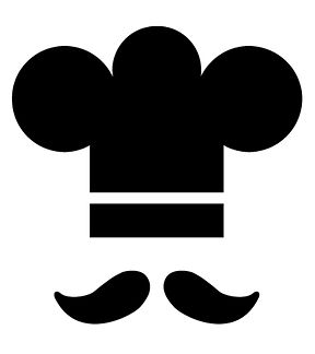
BARE
ESSENCE
Reduced to iconic imagery of hat and mustache.
REAL LIFE EXAMPLE #1
The Seattle Seahawks logo doesn't need to show the body or wings to convey the message of a bird. The important aspects are clear and stylized (eye and beak).

REAL LIFE EXAMPLE #3
The most important aspects are clearly visible (hat, hairstyle, scarf) and that's all that is needed.

REAL LIFE EXAMPLE #2
The Seattle Seahawks logo doesn't need to show the body or wings to convey the message of a bird. The important aspects are clear and stylized (eye and beak).

REAL LIFE EXAMPLE #4
This was a charity rock concert that was broadcast to a world-wide television audiences. Their goal was to raise money to help feed Africa. In my humble opinion, this is one of the greatest logos ever that fuses 2 unrelated concepts. The beauty is in its simplicity.
